Version 4.5
Within the new version the following issues have been worked on:
Preview

DESIGN CHANGE
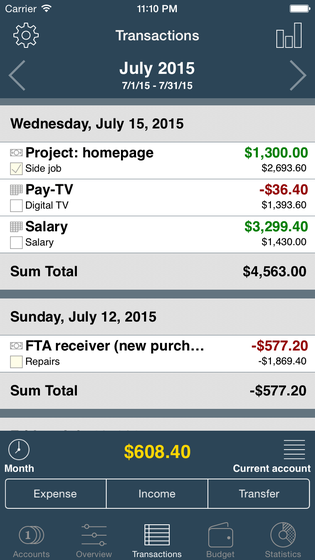
We decided to change the colour from black / dark grey to dark blue / blue-grey to make the app look fresher and more modern. In addition, we moved all important menus, switches and notifications in the iPhone version to the bottom. The reason is that as the newer devices are becoming bigger and bigger, with that the handling of the app worsens. Another improvement is a bottom bar for quick capture so that you can record your bookings (expenditure, income, transfer) even faster. I hope you enjoy the new design.


At the date display on the top exist several options to adapt the date and time period, respectively.

Option 1: Click on the date at the date display on the top. A new dialogue opens. Determine the date or time period.
Option 2: Touch the left or right arrow at the date display on the top in order to jump to the previous or next month.

Option 3: Swipe with your finger on the date display to the right in order to show the next month. If you swipe to the left, the previous month will show up.
In the lower display of the value you can change the view, select the account and invoke other commands.
Change view: If you click on the clock on the left you can switch between several views. A dialogue with more information opens.


In addition, you can easily change the view by swiping with your finger to the left or to the right on the value display. This is very useful for the statistics for example, if you only want to have the expenditure or income displayed.
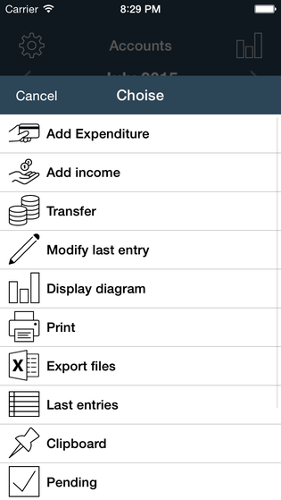
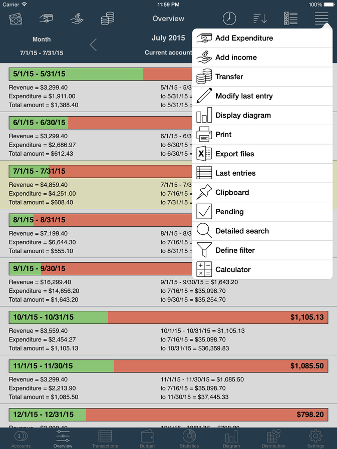
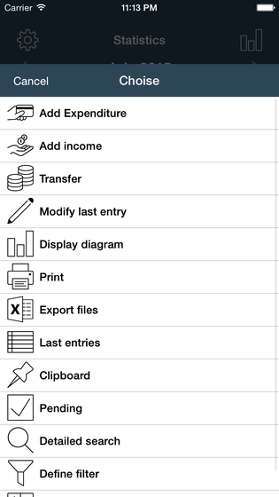
Call up menu: You get to the menu when you click on the lines-symbol on the right. A dialogue with many helpful commands opens (e.g. show diagrams, print, export data, …).


Here you also have the option to create a new booking entry or to edit a previously entered booking.
In the app every command has a distinct symbol (icon).
Select account: In order to select the account, simply click with your finger on the displayed value. A new dialogue opens. Choose either a specific account or use the option 'all accounts'.

In this dialogue you are shown more information for every account (account balance to date, income & expenditure & credit for the selected month or time period).
The pie chart shows you very nicely how much money you still have at disposal for the selected month.
We modified the illustration a little in the iPad version. In contrast to the iPhone version there only exists one bar, which is divided into two sub-sections:
Navigation bar: Here you find all important commands in form of symbols (select account | expenditure | income | transfer – select view | sorting/illustration | management | menu).
Information bar: In this area (view | date | account balance) the current account balance, the selected month and view are displayed. Here too exist "hidden" switches in order to make the work as convenient as possible for you.
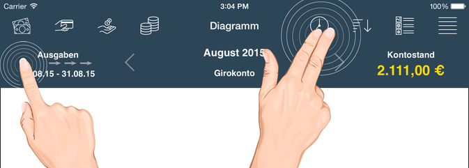
In order to change the view, click on the left area (information bar) or swipe with your finger. The display changes respectively to the direction. Alternatively, you can select the symbol (clock) in the navigation bar.
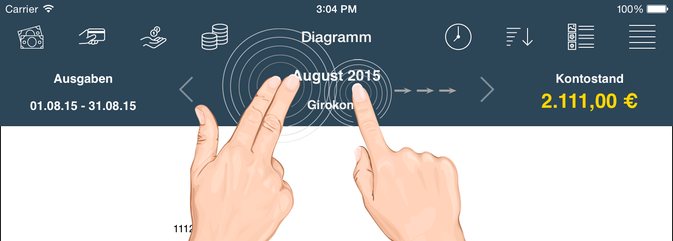
In order to change the date or time period, please click on the middle of the bar, or use the arrows, or swipe with your finger in one direction.
You have the option to select the account by choosing the first icon (bank notes) in the navigation bar.

You reach the menu with more commands by clicking on the lines-symbol at the right of the navigation bar.

All capture dialogues in the iPhone version no longer use the complete screen but are displayed downscaled. This is very useful for big devices (starting from iPhone 6).


NEW ICON
Our former icon has been getting a bit long in the tooth. For that reason we would like to use a flat, modern and simple icon. Our priority lay on recognition value.
Old icon (nice, 3D, detailed)
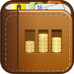
New icon (modern, flat, fresh)

Regardless of which iPhone/iPad/iTouch-background you use, the icon is always easy to recognise and possesses the same main features as the old successful icon (bar chart, categories, book).


We would be glad if you embraced the new modern icon as well as the old brown and detailed icon.
NEW GRAPHICS
In this version we regenerated nearly all graphics so that the illustration is even sharper and fresher on new apple devices (iPhone 6, iPhone 6+ and iPad Air2).
BACKUP & ICLOUD
Now it is even easier to save, download and delete your encrypted backup files in the cloud. In this process all devices are being synchronized and can access this backup nearly at the same time. The shown list is displayed in order (date+time).
CSV-FILES
We extended the CVS-import and now support more banks and apps:
-
1822Direkt (DE)
-
Badische Beamtenbank (DE)
-
Commerzbank (DE)
-
Deutsche Kreditbank (extended)
-
Bank Austria (extended)
-
EASYBank (AU)
-
BELFIUS Bank (BE)
-
MoneyCoach (App)
-
Filki (App)
Here you receive more information on the issue of data import.
ADVERTISEMENT ON ONE’S OWN ACCOUNT (MORE APPS)
At the end of the settings there is a list of all apps by OneTwoApps. This is a ‘little’ advertisement for us and our work. We hope for your understanding.


We are working on additional features… We are happy to receive advice and suggestions for improvement.
We hope you will enjoy the new version.
We would be very glad about an iTunes-rating. This will help us a lot for the further development of the app. Thank you.
Contact
iOS-Developer:
Christian Drapatz
Kämpenstrasse 42
45147 Essen (Germany)
Mobil: +49 (0)171 7849462
(No Support)
E-Mail: support(at)onetwoapps.com
http://www.onetwoapps.com
E-Mail: support(at)onetwoapps.de
http://www.onetwoapps.de